Knowlian
A clearer path through education.
- Design contribution
- Branding, UX/UI, Figma components, CMS
- Engagement
- Freelance via PotoDesign
Brand applications
Connect the education message across screens.
A consistent identity
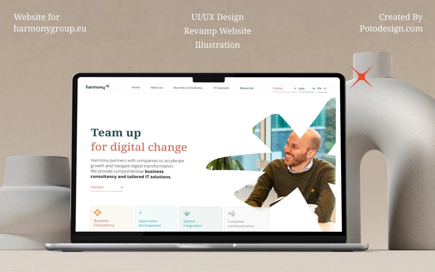
The school-finding message and green visual language appear across desktop and mobile presentations.
Colour system
Give different content types a shared visual foundation.
For a coherent website
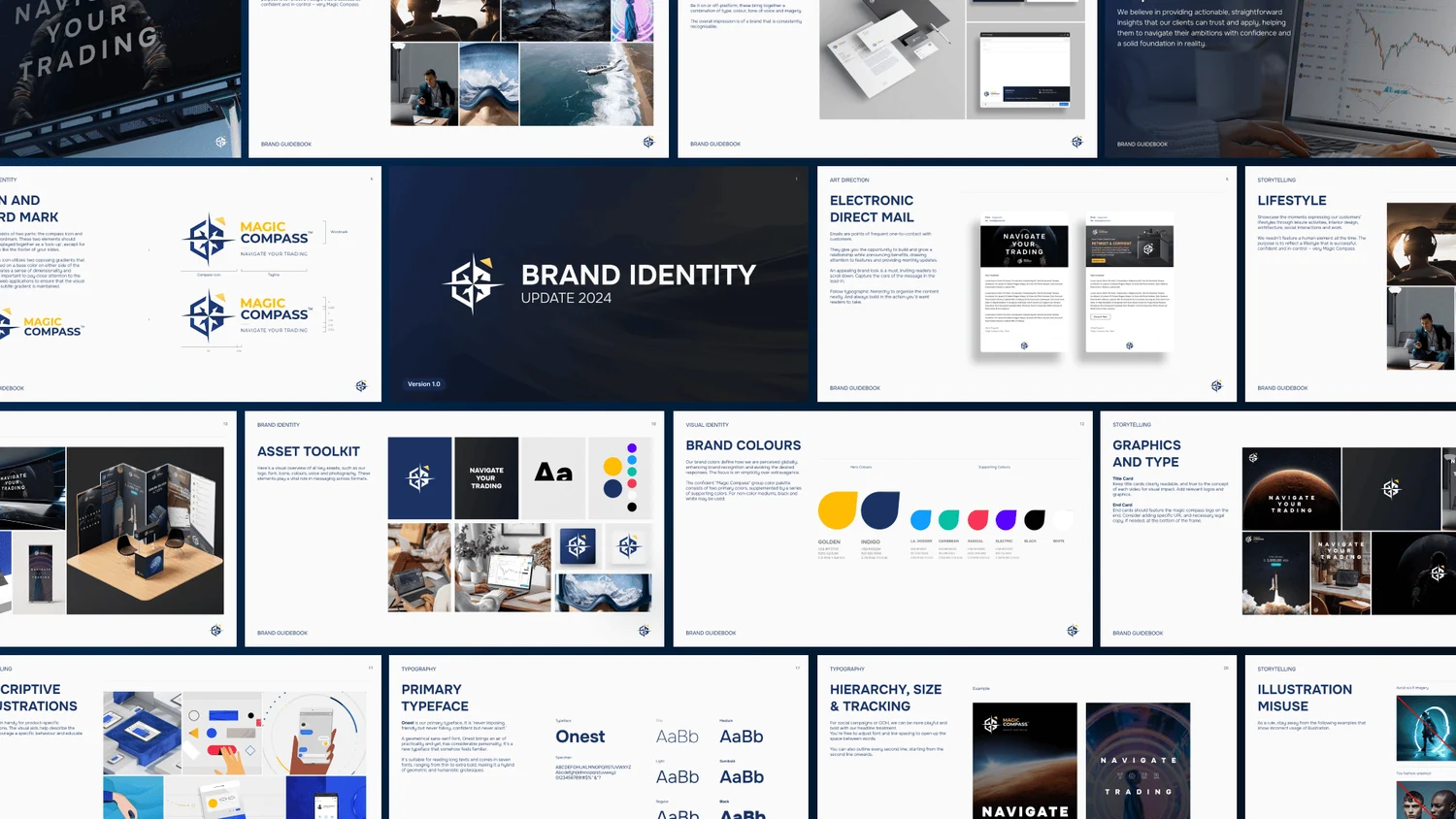
Deep blue and green anchor the identity, with supporting neutrals and tonal scales.
Website content
Organise services, stories and contact points.
Different visitor needs
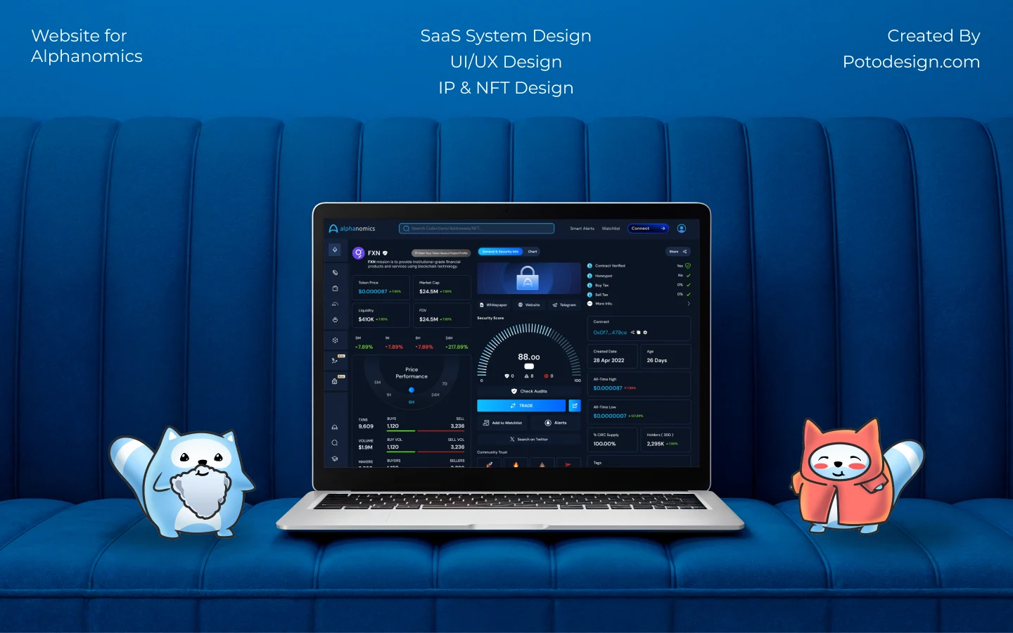
The page studies show a consistent treatment across family-facing and partner-facing content.
Partner offer
Present the reasons to work together as a clear set.
For education partners
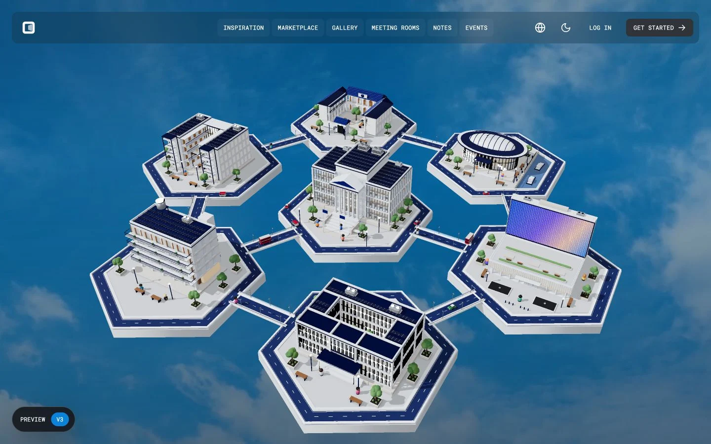
Four illustrated content blocks keep the partner proposition readable within one shared structure.